Harmonizing culture and consumer psychology: optimizing color schemes for children’s product design inspired by traditional ornaments | BMC Psychology

Color extraction process
With the aim of extracting the main colors of Turkmenistan’s traditional carpet patterns, this study applies five images of carpet ornaments relating to the five main tribes of the Turkmen nation, which are obtained from Internet resources presented in Fig. 3. Since color lines are adjacent to the surrounding colors, a procedure was undertaken to separate color shades by mosaic pixelation of a specific department in Photoshop to highlight/accent the dominant color. In the process of mosaic pixelation in Photoshop, a pixel size range of 15–20 was chosen. Due to the fact that these patterns are geometric figures, it was decided to divide them into 4 parts and use one part in case the colors in the pattern did not change presented in Fig. 4. However, if the pattern was generated from two different color combinations, it was divided into two principal parts to derive the color presented in Fig. 5. Consequently, 2 groups were established including two parts of the geometric pattern (Teke, Arsary), as well as, 3 groups of one part (Yomud, Chowdur, Saryk).
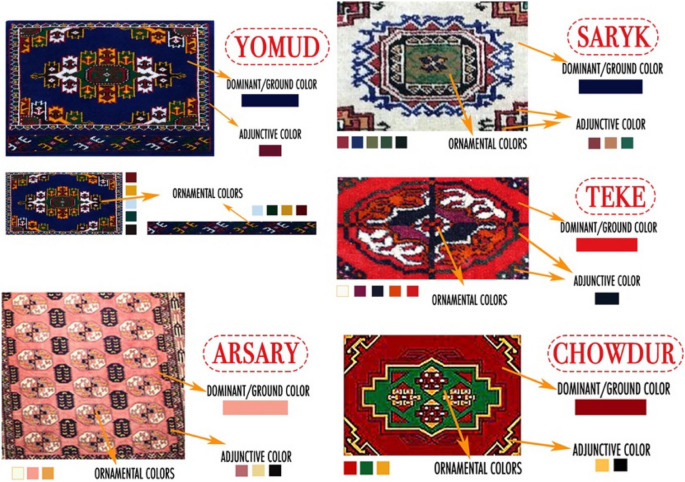
Images representing Turkmenistan’s 5 tribes
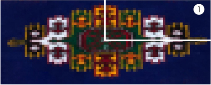
Division of one-color area for extraction
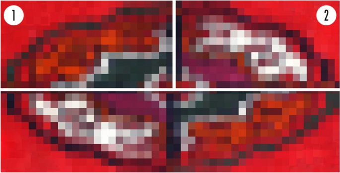
Division of two-color areas for extraction
To extract colors, the “Extract Gradient” function of the Adobe Color online generator is implemented, providing an RGB color value. Using this tool, 10 stops were made on a specific color from the main color, sub-color, and accent color, which was edited manually and set on the color by groups. For the content of the main color in a particular part of the ornament, 50% of the total surface was delivered; sub-color, from 10 to 50%; and accent color, less than 10%. Adobe Color supports the use of up to 15 stops for extraction; however, a decision was made to utilize only 10 stops to achieve enhanced clarity and precision. The color groups were assembled to analyze the characteristics and location of the colors, such as primary colors (red, yellow, blue), secondary colors (green, cyan, purple, orange), and composite colors (brown). Moreover, white and black-dark selections on the image were named light shades and dark shades of a particular color (blue, yellow, red, purple, brown). After the color classification, 11 main colors (warm and cool colors) and 220 color shades and tones were determined. Extracted colors were challenging to differentiate from each other, thereby, it was decided to select colors through the method of removing similar and redundant colors that cannot be easily distinguished. As a result, 110 color shades were obtained, precisely half of the initial number. The guiding principle for selecting the highlighted colors was their applicability to children’s products, a choice informed by a thorough review of color usage in existing products for children, as discerned from online references. This deliberate and considered approach ensured that the final selection of colors was not only visually coherent but also resonant with the intended audience and purpose.
After this procedure, the “Easy RGB” color data search engine is used on the basic mathematical equation and calculations, for the sake of preparing color swatches using one specific entered color data. Accordingly, contact color data is entered using the RGB space, which is automatically set by the illuminator and the ambient observer (D65/2°). All automatically generated secondary colors and the main color will be displayed in the RGB value. For a more accurate process to create a presentable color palette in the use of children’s product design, color compositions of 1320 colors were reduced by removing colors that are very close to similar. First, complete color groups were transferred to Keyshot to compare colors by applying colors to 3D objects and realistic visualization. Next, on the basis of the resulting rendered image, resembling colors were removed via processing similar colors on the color gamut, along with entering a numerical value in the text fields R, G, and B. Thus, 457 less or more saturated color shades and tones were selected. In addition, the color scheme generation process was carried out. To this end, the following rules had to be taken into account: (1) removing identical and undifferentiated colors; 2) apt color selection for use in children’s products. Consequently, of the 457 colors, only 140 representative colors were left, divided into groups under the name of each tribe, as well as subgroups by color (red-pink, green-blue-blue, purple, yellow-orange-.
Surveys sample overview
The first survey consisted of 104 parents including 51 men and 53 women who have children of preschool children from China. The survey was translated into Chinese language. All 104 participants completed the survey on color and color scheme preferences. The majority of participants were between the ages of 18 to 25. For the second survey, 48 parents of preschool children, including 22 males and 26 females aged 25–35 were invited.
Survey 1
In order to prepare a color scheme for use in children’s product design, the first survey was conducted on the emotional-psychological connection between color and user and how color influences a user’s feelings. The survey items were adapted from Ackerman [38]. The investigation of emotional characteristics of values and hues of color has been made. The prepared and already chosen color groups were performed to study the emotions provoked by users meeting with a certain color. Before conducting the questionnaire, this study researched which color hues most appeal to the consumers of children’s items. Subsequently, it was selected 124 colors of 6 color groups – red, yellow, orange, purple, green, and blue. First, it was asked to complete the questions related to the emotional expression of the user towards a specific color. Using the Likert scale, it was found that the favorite colors of preschool children were red and yellow, differing in gender. Besides, among the given 6 color choices, boys favored red (28.8%), orange (23.1%), and green (19.2%), whereas, girls preferred yellow (26.9%), red (25%), and orange (19.2%), see Table 1.
The survey established that red and orange were preferable to other choices in both genders, with boys electing red while girls chose yellow as their favorite color. However, the most unpopular colors were blue (boys 5.8%) and purple (girls 7.7%). Children did not find the colors blue and purple attractive and interesting. Nevertheless, it was asked for the parental preference of a color value of a certain color, such as color saturation, lightness, and darkness. Since parents tend to purchase the product for their children, hence, this point remains remarkable to success in the production business [17]. Consequently, the parental choice was stopped in 59 color codes as shown in Table 2.
Next, to examine the color association with children’s psychological perception, it was required to answer the question in the following order: (1) Positive; (2) Negative; (3) Neutral; (4) Mixed, and (5) Other (space for participant’s opinion). As a result, children had the most positive results with red (64.42%) color than orange (30.8%), yellow (26%), green (17.3%), purple (14.4%), and blue (9.6%), sequentially. Regardless of the literature, this study detected that the blue color had the least preference (boys 5.8%, girls 9.6%) and the least positive emotions (9.6%) in children since they perceived this color as neutral (51.9%). Moreover, green (none 43.3%), yellow (35.6%), and purple (30.8%) have not delivered any impact on children’s color-emotion associations. Thus, in order to understand how a certain color will impact a user’s emotions, it was decided to conduct a question on children’s color experience with proper adjectives. Through the literature review, after the filtration process, 18 adjectives that are suitable for testing psychological association with color were generated. The results showed that the most popular adjectives were in such order as excitement (yellow 86.54%), comfort (purple 83.65%; green 75.96%), curiosity (purple 80.77%), danger (red 77.88%), peace (yellow 76.92%), amusement (red 75.96%), happiness (yellow 74.04%), motivation (orange 65.38%), and safety (blue 60.58%) (Fig. 6). Consequently, the obtained results of emotional experience and user associations on the basis of the estimated factors were taken to further selection and color scheme verification.
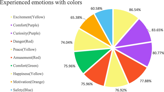
Q13-18 Color-emotional associations
Survey 2
After obtaining a particular number of colors for children’s products according to the findings of survey 1, colors varying in dimensions such as lightness-blackness, and brightness-saturation were transferred for the enduring color combination process. Next, survey 2 was conducted on color scheme generation using precise adjectives based on 180 emotional words from the Kobayashi color system [35, 36]. developed an image scale to produce color schemes by applying emotional words. He conducted a survey process to establish three color combinations on the soft/hard and warm/cool color scales. Thus, in his work, he developed 900 pairs of three-color combinations that have equal meaning with the established 180 emotional words on a two-dimensional color image scale. In light of color scheme verification, it was applied the evaluated emotional qualities of various color hues and tones to the tricolor combinations in the second questionnaire. For this experiment, the paper selected 74 emotional words from Kobayashi’s emotional word dataset, representing users’ emotional attachment to the prepared three-color combinations. Considering the first survey results, 14 color combinations – color schemes are assembled to research the emotional feedback of a user with a certain color set in order to find the accurate/veracious scheme for children’s product design. The following color combinations are shown in Fig. 7. Since parents are general clients, they contributed to the color scheme preferences in the second survey. A total of 22 questions were included, with 14 tricolor combinations to generate well-defined and respective emotional words in order to understand the user’s psychological preference regarding the color set for the benefit of product promotion. To this end, two following questions were asked: (1) Please rate the following color scheme according to your preference; (2) Please choose proper adjectives for the following color set. Initially, participants expressed their color preferences, providing data for color set verification. Subsequently, based on individual responses, relevant emotional descriptors for the color data were generated for use in the color combination image scale. In total, this experiment established 11 adjectives evaluated by their relevance to the current study and chosen color schemes, of which the results are shown in Table 3. Kobayashi’s color combination image scale consists of soft/hard and warm/cool two-dimensional spaces, where color sets relevant to each other are grouped into 13 categories [35]. Subsequently, these two questions supported the discovery of the applicability of prepared color schemes in these two-dimensional spaces by categories. As a result, the location of the tricolor combination on the specific areas of the color combination image scale was determined shown in Fig. 8.

14 color schemes – tricolor combinations
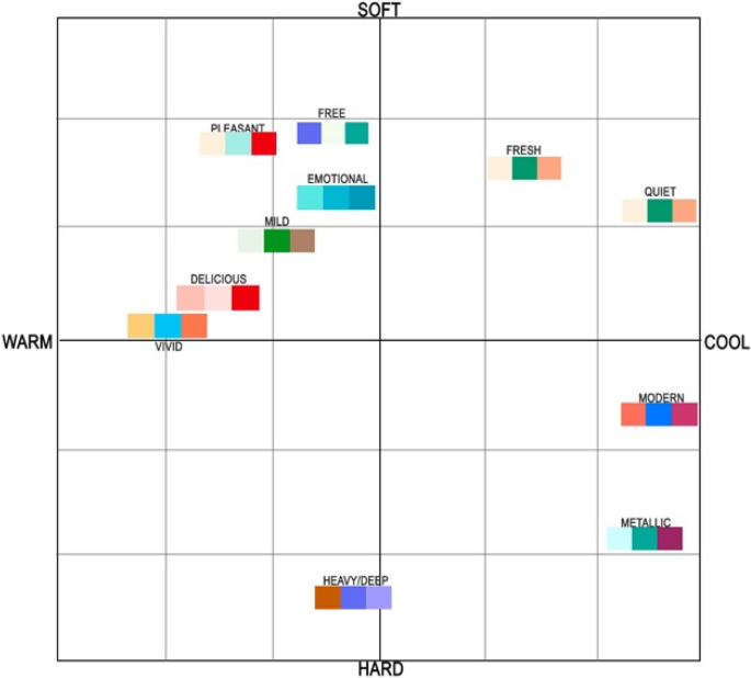
Verified color schemes on Kobayashi’s color scale
Verified color scheme samples
During the survey process, data on the color scheme and colors were developed and established. Using color matching techniques such as complementary colors and similar color combinations, this work combines primary, secondary, and tertiary colors into three-color combinations to generate color schemes. The color and color set formation process was achieved by generating the Likert scale questionnaire using extracted colors from Turkmenistan’s national carpet ornaments with valid emotional words. Thus, the results revealed that pale pink, blue, green, orange; very pale pink, green, yellow, blue; light grey-green, orange, green, purple, blue; deep red, green, blue; strong blue, green; grayish yellow, orange; dull yellow, orange, green; bright purple, red, blue, green; and vivid red, blue color hues had the highest preference and attractiveness among the users. Moreover, users preferred 11 color schemes out of 15 with the range of 54.17% − 33.33%, where 54.17% was the highest mark and 12.50% was the lowest.
In addition, reference images from online platforms, specifically Pinterest, were utilized to develop color schemes. To curate a relevant database, keywords such as “Children’s furniture,” “Toys,” and “Kids’ bicycles” were employed. Another avenue of research was the analysis of existing literature. A study by Jiang, Cheung [17] revealed distinct color preferences: girls favored pink and purple, boys preferred red, and both genders showed a preference for blue. The study highlighted a general preference for red and blue over green and yellow, especially in low-blackness colors. Furthermore, it underscored gender differences in color preferences, with males showing a greater inclination towards high chromatics, low chromatics, and achromatic colors compared to females.
These findings were instrumental in shaping the color schemes for children’s products, taking into account the nuances of gender-specific preferences, the psychological impact of color brightness and chromatics, and the cultural and emotional associations with certain colors. This comprehensive approach ensured that the selected color schemes were not only aesthetically pleasing but also aligned with the preferences and psychological responses of the target audience.
link


:max_bytes(150000):strip_icc()/GettyImages-1174825256-05ff10d1332949aa8dcfa7053a499961.jpg)
