
Design experts offer easy tips to add more colour to your home decor

The millennial greys that have been popular for the last decade are moving over to make way for bright colours in home decor trends
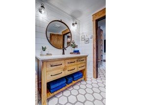
Article content
People have been experimenting with colour in their living spaces for quite some time now, but perhaps there’s a more intentional desire to add hues to your homes now more than ever.
Iris Piercey of Iris Interiors in Timberlea, N.S., said trends typically have a lifespan of a decade.
“The grey trend has been outgoing for the last couple of years and there is a new trend towards warmer, earthier tones,” she explained.
Advertisement 2
Article content

Joanne Harrison, of Jo’s Interiors in Sydney, N.S., added that the colours of the year from Benjamin Moore and Pantone are Cinnamon Slate and Mocha Mousse, respectively.
“[They] are each very muted warm tones that tend towards brown.”
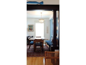
But there is a definite interest in colours that pop, too. Some of the tints being embraced by enthusiasts include light greens, sage, rich emerald greens, coral shades, lilac, fuchsia, bright and rich blues, terracottas, golds, ochres and bold reds, according to the Atlantic Canadian interior design experts.
Why the shift?
Erin Doyle, of Designed by Doyle in Dartmouth, N.S., credits people’s realization of how colour affects our mental and physical state as one reason.
“All colours have the ability to influence us in those ways, and living in all grey surroundings can actually impose feelings of depression and dampen our mental well-being over time,” she said.

We could be bringing back comforting childhood colours to combat a big and scary world too, shared Deborah Nicholson of Deborah Nicholson Interiors in Wolfville, N.S.
Advertisement 3
Article content
“Bright colours play a huge role in most childhoods, bringing joy, energy and a playfulness.”
Even on a fundamental level, we are drawn to bright and saturated tones, Nicholson points out. Take, for example, our ancestors who relied on spotting ripe fruit and nourishing berries in nature.

The pandemic could have contributed to the appeal toward hues as well, per Smita Prakash of Indriya Store in P.E.I. Being stuck indoors for long periods of time also meant that homeowners started looking at their surroundings and finding ways to make things joyful and uplifting, explained Prakash.
Something else that could be at play is the biophilic design appeal.
“[This] emphasizes our connection to nature. Earthy, warm tones, rich greens and ocean blues have become popular as people want to bring the outdoors in,” she added.
Personal expression could also be leading the charge, said Prakash, who added that there is less fear around taking risks.
There is a lesson to be learned from Europeans too, added Nicholson.
“They layer beloved pieces rather than replacing everything with the latest trend. This results in a colourful and multi-patterned home that feels lively, warm and deeply personal.”
Advertisement 4
Article content
Even so, shifting from the known – the greys and browns – can feel disconcerting for some. How do you know you’re making the right call? How much is it all going to cost? These Atlantic Canadian design experts have some useful tips for how you can go about it all without spending too much.
How to infuse colour into your home without breaking the bank
Work with what you have
Before you go replacing every piece of furniture and wall decor to inject colour, take a look around. If grey is what you’re working with, there’s good news, according to Harrison.
“Grey is actually a neutral colour, which means that if you do desire to add some new colours to your space, you should be able to do so.”
As for what elements can bring in colour, what you already own could provide the answers, said Nicholson.
“Unpack treasured heirlooms, vibrant dishware or patterned textiles and display them proudly,” she suggested.
Colour pieces worth investing in
Throw cushions with colour and patterns, vase or candle holders of the same hues, a coordinating throw blanket, flowers and colourful artwork are all cost-effective means of adding shades to your home, according to Piercey.
Advertisement 5
Article content
“There are big box stores that offer a large assortment of artwork for a very reasonable price,” she said.
Something interesting you might not have thought of are hardcover books with coloured spines. In fact, Piercey recommends this to inject colour and interest.
“I look for books that have a common interest with the client … Go to second-hand stores and get books for little investment,” she added.
Area rugs are another great tool. Piercey herself changes her area rug twice a year to reflect the seasons. While there are rugs that can cost tens of thousands, there are ones that cost far less — a couple of hundred dollars — said Piercey.
Don’t rule out thrift and antique stores
Thrifting and antique shopping can lead you to beautiful, unique and colourful pieces, reminded Doyle.
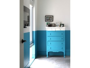
Giving thrifted or existing furniture and decor pieces a colourful makeover is a quick and inexpensive way to go about things.
“Love your table lamp, but need a change in the space? Grab a can of your favourite bright hue from the hardware store and let the paint fly,” said Doyle.
Accent walls
Speaking of paint, why not take the hues to the walls and create an accent wall? P.E.I.-based Prakash shared that giving one wall a bold hue is a lot less expensive than repainting an entire room.
Advertisement 6
Article content

One important thing to note with painting, however, is to get paint chip samples and see how they work with your home’s existing lighting, said Doyle.
“Lighting can change the feel of a paint colour drastically, so having those samples in the space you’re going to paint is crucial to you loving the end result.”
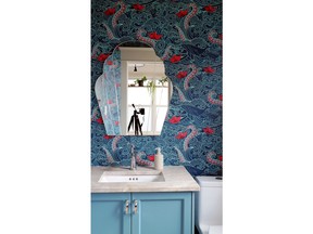
A word on wallpapers
Wallpaper might be considered old-fashioned by some but it’s a great tool when you want to inject colour without spending a lot of money.
Prakash recommended wallpapers for renters and people who aren’t quite ready to commit to hues.
With wallpaper, however, you may want to pay attention to quality, said Nicholson.
“I have concerns about the toxicity of cheaper ones,” she said.
If you’re worried about this, you could just hang up a colourful blanket or quilt on the wall, said Nicholson. Even a French salon wall with photos and other memorabilia can be a good alternative, she added.
Colour blocking, prints and patterns
Colour blocking can accomplish two things, according to Nicholson: add hues and remedy a room’s flaws.
“Make a narrow room appear wider or provide a focal point where none exists” with colour blocking, she said.
Advertisement 7
Article content
Colour can be added with prints and patterns too, but this might be something that can make you even more nervous.
Clients often have a love-or-hate reaction with patterns, said Doyle.
“I think that mixing of patterns can feel overwhelming and too stimulating to some people, but can invoke a sense of joy and creativity in others,” she added.
Harrison enjoys mixing and matching patterns as long as the colours come together.
“In general, it’s preferable to match a bigger pattern with a smaller one, just for balance,” said the Cape Breton resident.
Whether it’s floral, striped or checkered, patterns add interest, she added.
Patterns can bring in depth and personality too, per Prakash. In addition to balancing scale and colour with prints and patterns, going for a common colour thread with your pieces can make things feel intentional instead of chaotic.
There is also a sense of movement that comes with patterns, per Nicholson.
“A space without patterns can feel static and uninviting.”
That being said, there is such a thing as too much pattern, cautioned Nicholson, which is why she recommended looking to the seven principles of interior design when considering patterns and prints. They are “balance, rhythm, emphasis, scale, harmony, contrast and repetition.”
Advertisement 8
Article content
Recommended from Editorial
-

How to choose the perfect paint for your walls
-

Common misconceptions about paint
-

Don’t be afraid to go bold: Give those neutral rooms and a much-needed jolt of colour, urge Atlantic Canadian interior design experts
-

EAST COAST MOMMY: Refresh a room on a budget
-

LIFE HACKS: Painting on your summer agenda? Here’s the best way to tackle your project like a pro
Don’t be afraid to try something new
Trends come and go but there is no hard and fast rule that you should change with them.
The most important thing to remember is that this is your home, added Harrison.
“It should tell your story [and] incorporate your memories, be they from family, travel or just things that are simply meaningful to you.”
However, if you’re shying away from bright colours because of fear, you might want to think again, Nicholson said. Worrying that you’re going to be viewed as childish, making a mistake or getting bored with a bold hue are all fears some people experience.
“But here’s the thing – when we go with the safe, unsaturated colour, we hardly notice it after a week. Go for the colour that excites you! It’ll look outrageous for a day or two and then you’ll settle into it and it’ll put a smile on your face every time you walk by.”
Article content
link


