
2026 Color Trends: Staying Warm

When the state of the outside world is uncertain and a bit chaotic, people tend to retreat to their homes and surround themselves with things that offer familiarity and comfort. Today’s homeowners are definitely staying true to this idea, but unlike in the past when there was a rush to simple, pale neutrals, the current trend is toward richer tones, and incorporating warmth through items such as woven rugs, cozy throws and patterned wallpaper.
When it comes to color, homeowners are leaning hard into natural tones, relying on the familiarity of nature to deliver both the calm and energy they crave. Blues and greens have been in favor the last few years, but color choices are now extending to brown tones, including complex, deep beiges and shades of greige.
“In 2026, interior color is moving toward a more confident and emotionally rich place,” observes Emily Kantz, color marketing manager for Cleveland, OH-based Sherwin-Williams. “We’re seeing homeowners loosen their grip on restraint and lean into spaces that feel expressive, layered and personal.
“On one end, there’s a clear appetite for bolder color – deep greens, saturated jewel tones and dramatic mid-to-dark hues that bring depth and personality into a room without feeling flashy,” she continues. “At the same time, there’s an equally strong pull toward comfort-driven palettes that prioritize warmth and ease. Earthy neutrals, softened browns and nature-inspired tones are being used to create interiors that feel cocooned and restorative.”
“For 2026, we’re seeing a strong shift toward colors that evoke calm, comfort and connection with nature. Neutrals, soft earth tones and warm wood-inspired shades are gaining popularity, alongside carefully curated accent colors that add personality and depth,” concurs Stacy Garcia, CEO & chief inspiration officer, Stacy Garcia Design Studio in Nanuet, NY. “The driving forces behind these trends are cultural and environmental: homeowners are seeking spaces that support wellbeing, self-expression and sustainability.”
“People want their homes to feel comfortable, personal and restorative. That’s a big reason why warm neutrals and muted tones are having such a moment,” adds Leah Bolger, principal, Leah Bolger Design in Chicago, IL. “These palettes create spaces that feel grounded and easy to live in. At the end of the day, color trends are a reflection of how we’re feeling collectively. And right now, there’s a renewed embrace of calm, warmth and a more intentional way of living.”
With regard to the immediate future, she believes home interiors will lean even more into soft, grounded color palettes. “Neutrals and muted tones are getting cozier and more calm. Neutral beige tones, warm taupes, dusty greens and more subtle earthy shades that create a sense of calm within a space (without trying too hard!) will be embraced,” she continues.
Bolger doesn’t believe that brighter colors will disappear, but instead will shift into more of a supporting role. “Instead of big, bold statements, you’ll see them appear in smaller, intentional ways, and as accents that enhance and elevate the neutral palette taking center stage,” she remarks.
In keeping with this concept, Bolger believes the varied choices for Colors of the Year are on point. “There’s a huge shift toward well‑being and creating spaces that feel restorative, and these colors really support that,” she stresses.
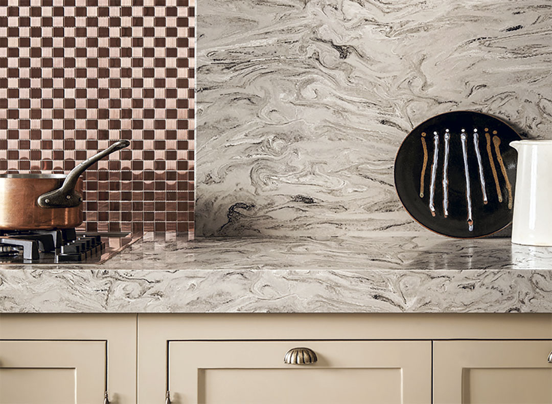
Many of the choices for Color of the Year from the major paint companies are similar in concept and tone. Shades of olive, deep taupe and grayed brown are among the top choices.
From Benjamin Moore comes Silhouette AF-655, a mix of rich espresso hues with subtle notes of charcoal. “The connection between fashion and interiors has always been a source of inspiration, but this year, in particular, we’ve noticed a renewed interest in suiting and classic silhouettes; the resurgence of timeless pieces, and the growing interest in the brown color family,” comments Andrea Magno, director, color marketing & design at Benjamin Moore in Montvale, NJ.
Valspar has named Warm Eucalyptus as its 2026 Color of the Year, a shade that is “naturally restorative and serene,” according to the company. “Warm Eucalyptus is more than just a beautiful shade of green, it’s a reflection of the comfort we crave in our homes,” offers Sue Kim, director of color marketing at Minneapolis, MN-based Valspar. “Its warm undertones create a grounded, welcoming mood while drawing inspiration from nature and the familiarity of retro design.”
Sherwin-Williams and HGTV Home by Sherwin-Williams introduced a unified 2026 Color of the Year: Universal Khaki. “Universal Khaki is an earthy and timeless mid-tone tan that has a slight yellow undertone that is typically associated with heavy canvas material, uniforms and outdoor gear,” states the company.
“Selections like muted, deep neutrals such as Warm Eucalyptus, Silhouette and Universal Khaki align with the trend toward flexible, nature-inspired palettes that bring warmth and subtle depth to a space,” notes Stephanie Pierce, director of design and trends at MasterBrand Cabinets in Beachwood, OH. “In cabinetry, they’re often used on base cabinets or islands, letting natural wood tones or stained wood uppers shine in contrast. When paired with light to mid-tone wood finishes, these colors create a balanced, layered look.”
“I think the [colors of the year] absolutely capture the mood of the moment,” concurs Garcia. “These muted and earthy neutrals reflect the broader cultural focus on calm, restorative living. They work beautifully in combination with natural materials, sustainable finishes and tactile textures.”
“These hues make perfect sense for where design is headed,” adds Lindsay Olson, principal, Lulu Designs in Newport Beach, CA. “Homeowners want palettes that feel layered and expressive without overwhelming the architecture bones, and these deeper neutrals allow for that. They serve as a strong backdrop for both vintage pieces and the artisanal, handcrafted work clients are prioritizing more than ever.”
Color Transitions
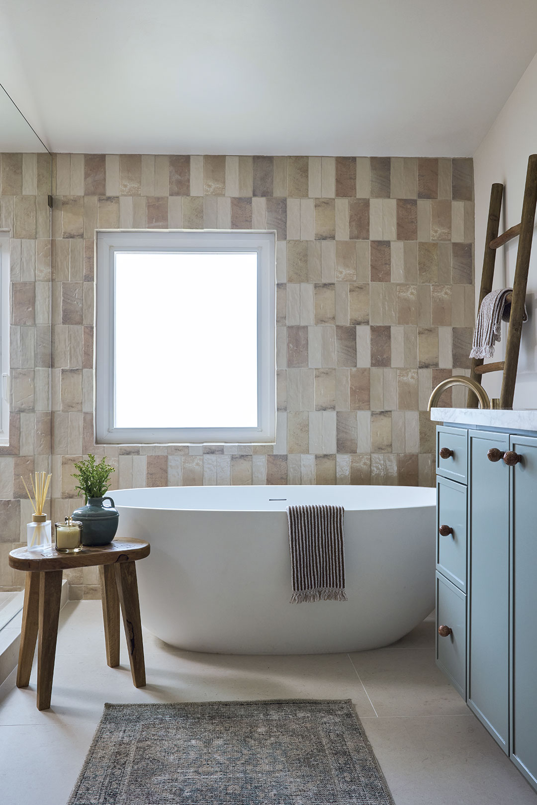
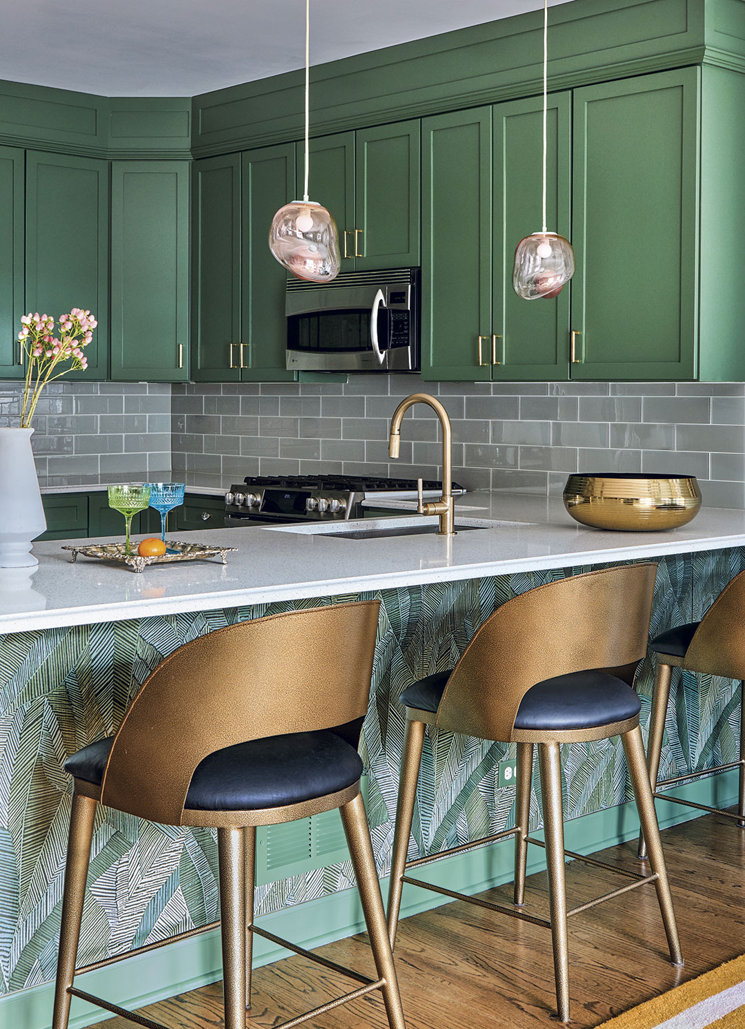
When it comes to color, the past few years have witnessed the transition from gray to blue to green, a natural path for clients who are willing to play with a little color. Blues ranged from softer pastels to cobalt to navy, and many of those tones are still a go-to choice for kitchens and baths. The incorporation of green, especially shades found in nature, is not only still ongoing, but gaining in popularity.
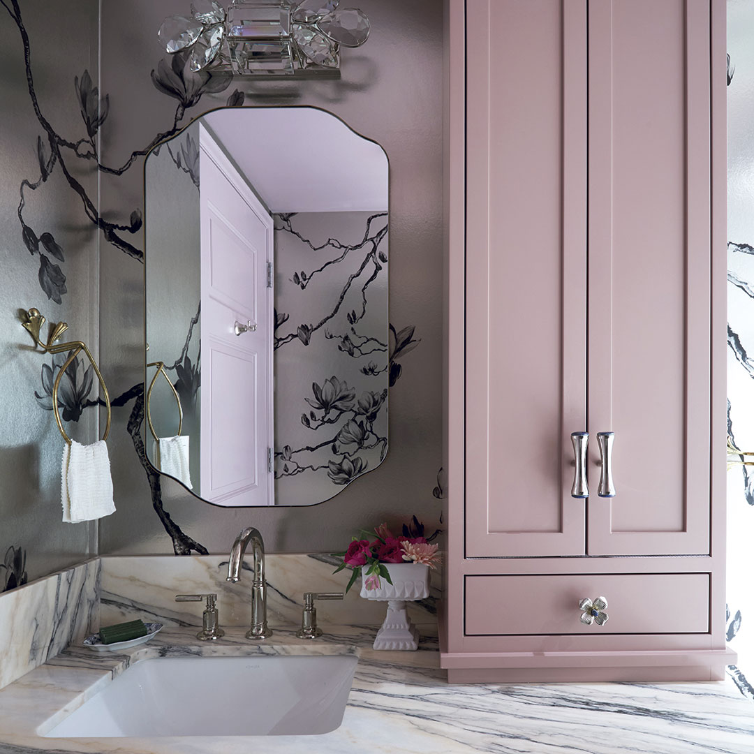
“We’re finally seeing the pull away from blues, and instead bringing more lush greens into the home,” stresses Rebecca Sutton, CMKBD, CKBR, senior designer at Dallas, TX-based Kitchen Design Concepts. “Green is the next natural progression – and still complements blue in most cases.” She adds that people are starting to layer in smaller, more personal pops of pinks and yellows that complement green without being overwhelming.
Shae Wilder, manager of Designer Relations at BlueStar in Hebron, KY, also sees pink gaining ground. “Pink has been sneaking its way into the kitchen and even into pantry spaces for years now,” she says. “We are beginning to see designers specify and custom color-match specific pinks.”
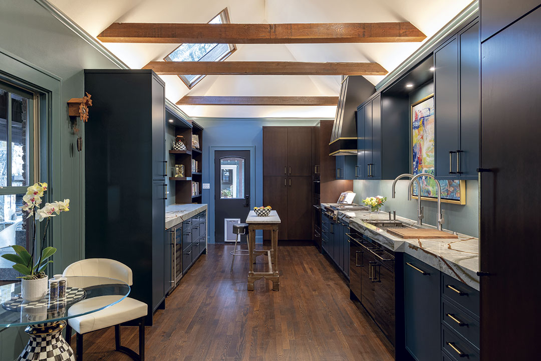
“In kitchens and baths, my clients are increasingly open to color that has depth and character – especially greens and complex blues,” reports Jasmin Reese, principal, Jasmin Reese Interiors in Chicago, IL. “Those hues feel grounded, a little historic and very sophisticated, which work beautifully on cabinetry, vanities and butler’s pantries.”
Reese notes that she enjoys using richer colors in these hardworking spaces because “it instantly makes them feel designed rather than purely utilitarian. Then I balance them with beautiful stone, mixed metals and different lighting so the room feels layered.”
Of course, there are other shades in nature besides blue and green, and they are getting a fresh look.
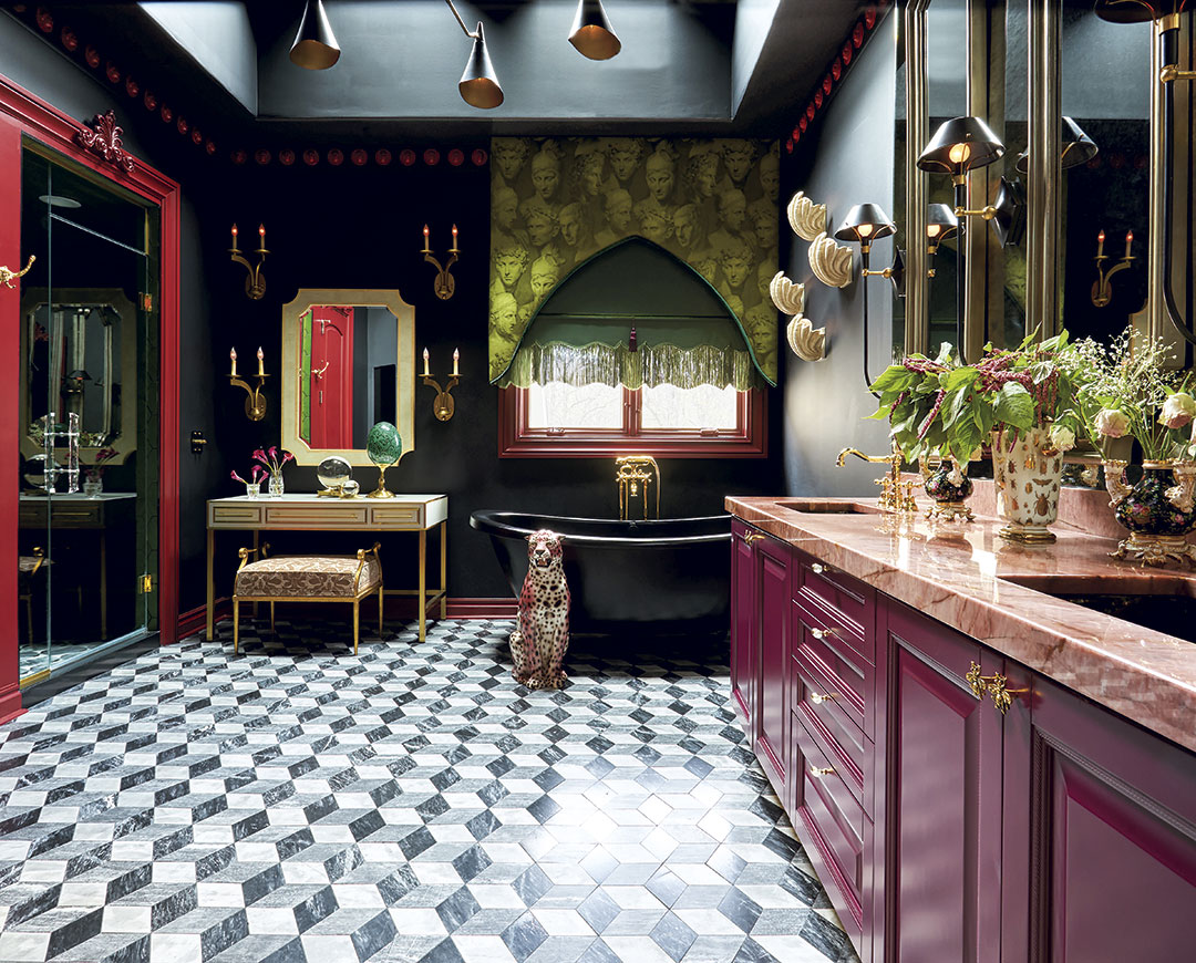
“The growing interest in the brown color family has been quite notable, particularly in fashion and interiors where they are emerging as an alternative hue to black and gray. Dark chocolatey hues, sophisticated caramels and cozy cocoas have been recognized as equal parts inviting and chic,” notes Hannah Yeo, senior manager, Color Marketing at Benjamin Moore & Co. She adds that, while the stand-alone brown family is on the rise, “we’re also seeing its influence seep into other hues as undertones, resulting in overall shift towards warmer hues. Reds and oranges are taking on a moody, organic, clay-like character while bronze, ochre accents and other earthy nature-inspired tones are poised to make a strong statement in 2026.”
BlueStar transitioned from its color choice of Signal Brown for 2025 to the more vivid Purple Violet as its 2026 Color of the Year. Selected by Shumaker Design Associates, the color reflects a growing shift toward “richness, warmth and grounded bold design in the home,” notes the firm.
And Sutton believes maroon will be embraced in the coming years. “The browner versions are almost a true neutral, and maroon in general pairs really well with the navy and forest green colors that have been popular over the last few years,” she comments.
“Greige, near-black dark brown, and ‘fashion’ neutrals provide natural palette elements upon which to grow, and eventually introduce stronger accent colors for fun and joy, taken directly from sun, sky and florals,” remarks Mark Woodman, CMG, Corian Design Aesthetics Consultant/Brand Ambassador. “The human desire to connect with nature continues to drive the biophilia influence. It will bring stone looks to the forefront with slightly softened colors to balance the excitement of the bolder stone aesthetics.”
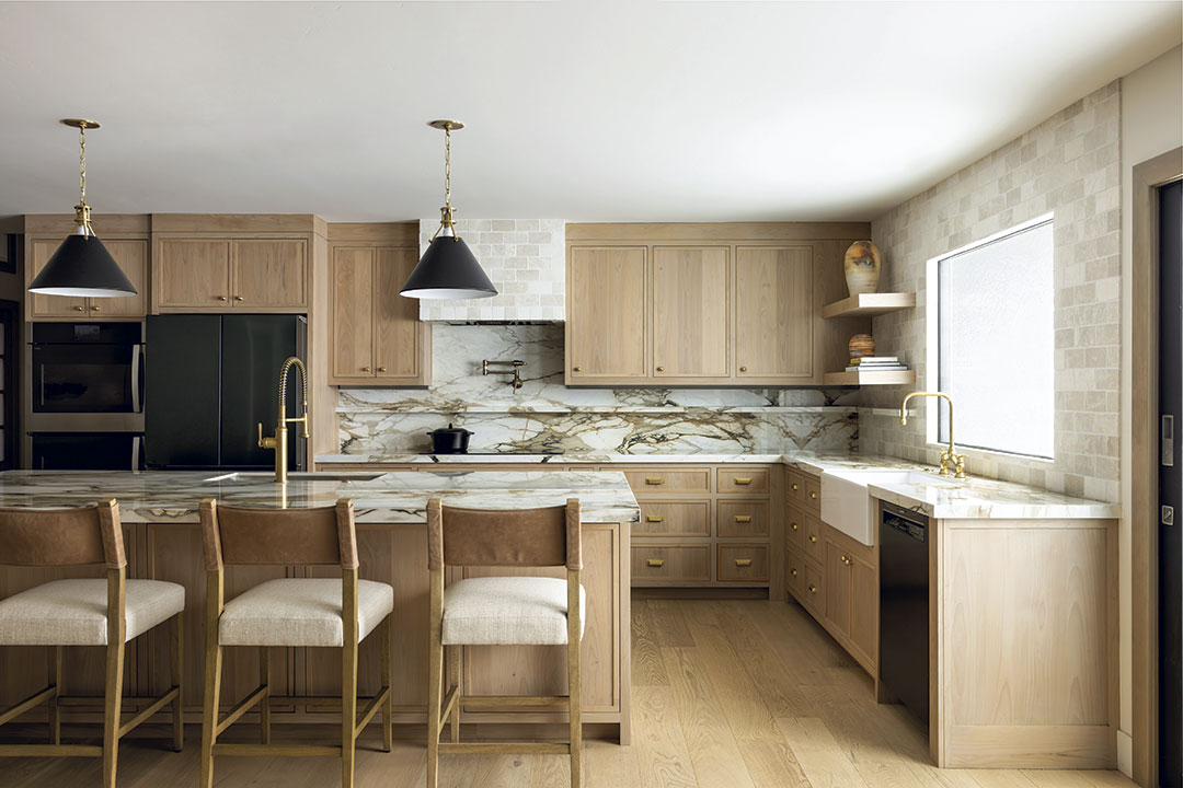
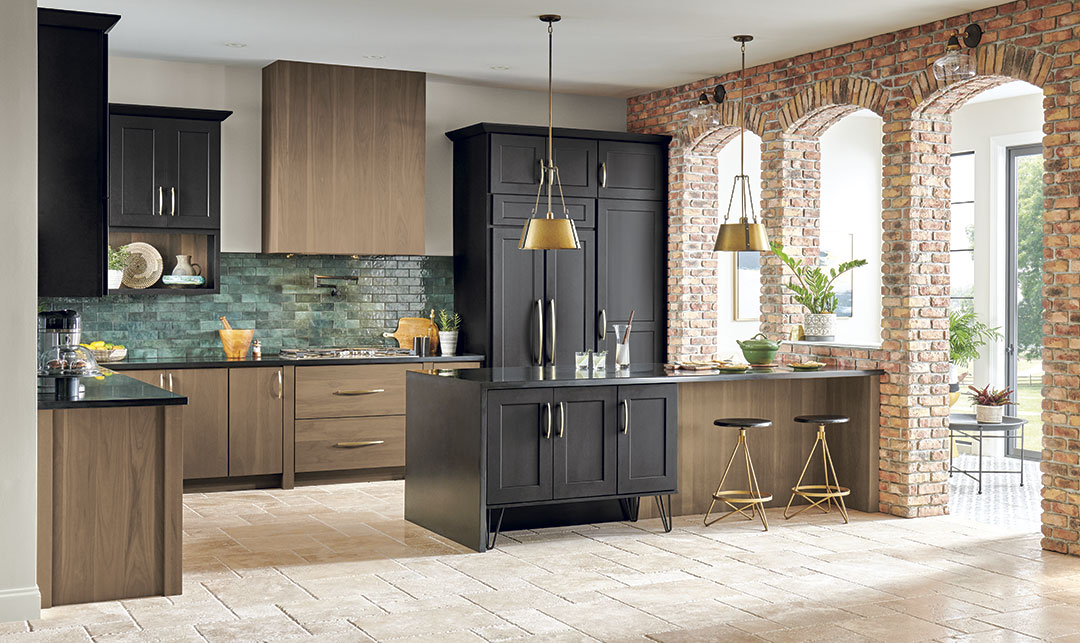
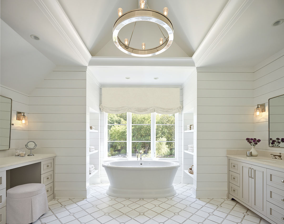
Industry professionals agree that, with the rising attraction to nature and biophilic design, woods and stones will continue to gain prominence. Light and mid-toned woods are favored over dark, and stones are continuing to transition from cool marble shades to warmer tones.
“Neutrals are being paired with natural materials like wood and marble in a way that feels much richer than the ‘all‑white everything’ era,” details Bolger. She adds that wood cabinetry is “having a real moment again, especially when it’s done in softer, warmer stains. It brings so much warmth and texture into a space, and when you pair it with beautiful natural stones, the whole look feels elevated but still very calm and livable.”
“We’re seeing dusky, adaptable hues – muted greens, soft blues, warm greiges and richer greens like Lush Forest,” she reports, adding that wood finishes, especially light to mid-tone stains and warm earthy options, pair beautifully with these palettes and creamy neutrals. “Together, neutrals and natural wood create the layered look people are gravitating toward,” she observes.
“In our projects, neutrals and natural wood tones are popular because they create spaces that feel grounded and timeless,” notes Garcia. “After years of high-contrast, statement-making design, there’s a real desire for comfort, warmth and longevity. These finishes also provide a versatile backdrop for layering textures, artisanal pieces and personal accents – so people can express their individuality without overwhelming a space.”
Olson remarks that warm walnut tones and quieter, more subdued natural stones are rising quickly in popularity. “Neutrals are no longer placeholders. They’re becoming the foundational palette upon which richer accent colors are layered,” she relates. “Clients are gravitating toward these finishes because they feel classic, grounded and reflective of a ‘forever home’ mindset. People want well-made environments that are warm and enduring, and natural materials support that shift beautifully.”
White Redux
With these rich, nature-based tones taking honors as colors of the year, the biggest surprise came courtesy of the Pantone Color Institute, which announced Cloud Dancer as its choice for the top spot for 2026. The selection of this shade of white as its choice was a shock to many, who were expecting a deeper tone in keeping with the overall trend.
For Pantone, which describes Cloud Dancer as “a billowy, balanced white imbued with a feeling of serenity,” reaction was swift and somewhat polarizing. After years of trying to convince clients to move away from white, many designers were not enthusiastic about embracing this shade once again. For others, however, the choice made perfect sense – one that reflected optimism and hope for better days ahead.
“This has been an electrifying selection in the world of design,” notes Woodman. “White? White takes guts as it has to prove itself interesting.”
He notes that Corian Design has been creating softly veined whites for its surfacing portfolio, and Quietude was launched a few years ago to address the “noise of daily life. So, ‘white’ has been on a journey to reflect the need for ease, quiet and a sense of contemplation.”
“Using different values, combining cool and warm looks, and celebrating it as a key player in a design will help shed light on the nuances of white and demonstrate that white is not plain and simple. It is nuanced and sophisticated, and anything but basic,” he adds.
“I’m loving Pantone’s Cloud Dancer,” stresses Bolger. “It has a soft, airy quality that feels serene and quietly optimistic. It’s not a stark or clinical white – instead, it has an ethereal, comforting vibe that instantly softens a room.”
“Classic whites and creams have always been among the most popular colors, but we’ve seen a warming trend in recent years,” explains Ashley Banbury, color marketing manager at HGTV Home by Sherwin-Williams. “These new neutrals are replacing starkness with warmth and purpose, and the milky white announced as the Pantone Color of the Year serves the purpose of inspiring reflection and creative exploration.”
“Classic white is a staple – it’s not something we would ever consider ‘in’ or ‘out.’ It’s timeless and works with everything,” adds Reese. “We might incorporate a classic white like Cloud Dancer on the walls to establish a classic architectural envelope that lets everything else have some fun. Then, we would use that neutral backdrop to introduce a really bright palette everywhere else, perhaps by papering the ceiling or using bright accents on a banquette or window treatment. White gives you breathing room, but it doesn’t mean the rest of the room has to be quiet.”
Indeed, rather than the past and the concept of the all-white kitchen, the newest strategy for white is more as a supporting player in the design, according to many design pros.
“The choice [of Cloud Dancer] reflects a broader emotional desire for a clean slate, but it does not fully reflect what is actually happening in residential design right now,” argues Sutton. While white will always have a place, it is typically used as a supporting element rather than the foundation of a space, she continues. “We incorporate it strategically on trim, ceilings or to balance deeper, saturated colors, allowing color to lead while keeping the space feeling light and cohesive.”
“A soft, classic white like Cloud Dancer still has a place, especially as a balancing element within a curated palette,” concurs Olson. “Whites will be used more intentionally, as a way to highlight scale and architectural detail. In kitchens and baths, whites can help quiet the space, allowing contrasting woods, stones or fixtures to take the lead without competing.”
A Bold Future
And just where are colors heading beyond 2026? There are as many opinions as there are colors, it seems, but most agree that the future looks bold.
“While 2026 is anchored in soft neutrals and earthy tones, we expect to see bolder, richer colors make a comeback in the years beyond – particularly in accents, art and statement furnishings,” notes Garcia. “Colors like deep terracotta, jewel-inspired blues and vibrant greens will complement the calming neutrals we’re currently championing. The trajectory is toward balance: softer, restorative palettes as the base, with strategic pops of color for personality and self-expression. Homeowners are craving both comfort and creativity, and color will be the key way they achieve that.”
“As consumers remain in their homes for longer periods, their spaces will need to be even more personal. They may begin with softened neutrals, but then introduce bolder colors to the mix. Reflecting not only personal space and lifestyle, colors will offer even more about the inhabitants’ journey,” explains Woodman. “Rich spice hues are expected in the coming years to warm and soften neutrals with something enticing.”
“What I do see continuing into 2026 is a move toward color that feels emotionally driven rather than ‘safe.’ That might mean rich jewel tones for one client, a moody green for another, or a layered neutral story for someone else,” notes Reese. “The driving force isn’t a specific shade of the year – it’s that people are tired of cookie-cutter spaces and want homes that feel like them.”
She believes that color will continue to get bolder and more individual. “The future isn’t about choosing ‘team bright’ or ‘team neutral’; it’s about using color more intentionally,” she explains. “Whether the palette is quiet or saturated, it should feel specific to the person living there and tell a story that still feels special years from now.”
link

:max_bytes(150000):strip_icc()/GettyImages-1174825256-05ff10d1332949aa8dcfa7053a499961.jpg "Pantone Just Revealed Its 2026 Color of the Year")


